Plot the percent of the variation that is explained by batch and condition in the data
Source:R/plotBatchVariance.R
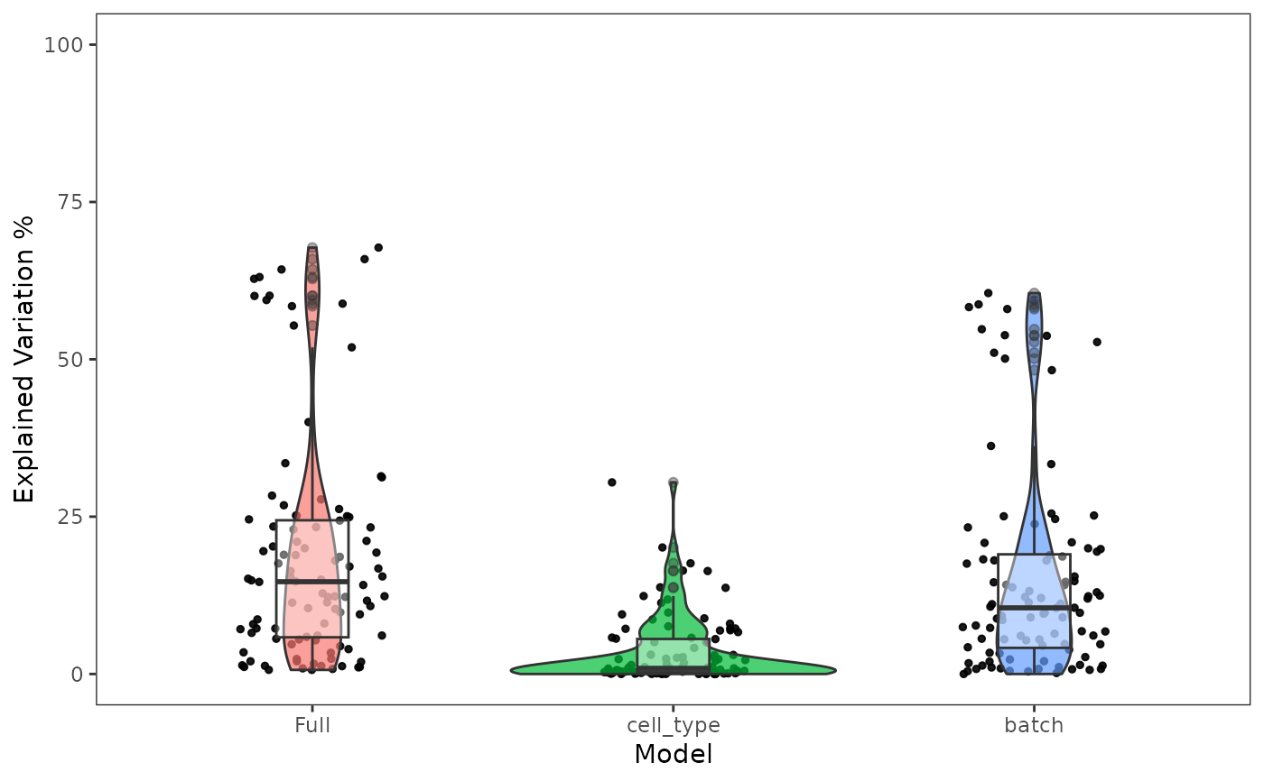
plotBatchVariance.RdVisualize the percent variation in the data that is explained by batch and condition, individually, and that explained by combining both annotations. Plotting only the variation explained by batch is supported but not recommended, because this can be confounded by potential condition.
plotBatchVariance(
  inSCE,
  useAssay = NULL,
  useReddim = NULL,
  useAltExp = NULL,
  batch = "batch",
  condition = NULL,
  title = NULL
)
Arguments
- inSCE
SingleCellExperiment inherited object.
- useAssay
A single character. The name of the assay that stores the value to plot. For
useReddimanduseAltExpalso. DefaultNULL.- useReddim
A single character. The name of the dimension reduced matrix that stores the value to plot. Default
NULL.- useAltExp
A single character. The name of the alternative experiment that stores an assay of the value to plot. Default
NULL.- batch
A single character. The name of batch annotation column in
colData(inSCE). Default"batch".- condition
A single character. The name of an additional condition annotation column in
colData(inSCE). DefaultNULL.- title
A single character. The title text on the top. Default
NULL.
Value
A ggplot object of a boxplot of variation explained by batch, condition, and batch+condition.
Details
When condition and batch both are causing some variation, if the difference between full variation and condition variation is close to batch variation, this might imply that batches are causing some effect; if the difference is much less than batch variation, then the batches are likely to be confounded by the conditions.
Examples
data('sceBatches', package = 'singleCellTK')
plotBatchVariance(sceBatches,
                  useAssay="counts",
                  batch="batch",
                  condition = "cell_type")